Color
Convey meaning through color. Out of the box you get access to all colors in the Material Design spec.
The Material Design color system can be used to create a color theme that reflects your brand or style.
Color system
Important Terms
"Palette"
A palette is a collection of colors, i.e. hues and their shades. Material-UI provides all colors from the Material Design guidelines. This color palette have been designed to work harmoniously with each other.
"Hue" & "Shade"
A single color within the palette is made up of a hue such as "red", and shade, such as "500".
"red 50" is the lightest shade of red (pink!), while "red 900" is the darkest.
In addition, most hues come with "accent" shades, prefixed with an A.
Examples
The Material Design color palette comprises primary and accent colors that can be used for illustration or to develop your brand colors. They’ve been designed to work harmoniously with each other.
For instance, you can refer to complementary primary and accent colors (for example 'red 500' & 'purple A200'), like so:
import purple from '@material-ui/core/colors/purple';
import red from '@material-ui/core/colors/red';

const primary = red[500]; // #F44336
const accent = purple['A200']; // #E040FB
const accent = purple.A200; // #E040FB (alternative method)
Color palette
Given a HUE (red, pink, etc.) and a SHADE (500, 600, etc.) you can import the color like this:
import HUE from '@material-ui/core/colors/HUE';

const color = HUE[SHADE];- red500#f44336
- 50#ffebee
- 100#ffcdd2
- 200#ef9a9a
- 300#e57373
- 400#ef5350
- 500#f44336
- 600#e53935
- 700#d32f2f
- 800#c62828
- 900#b71c1c
- A100#ff8a80
- A200#ff5252
- A400#ff1744
- A700#d50000
- pink500#e91e63
- 50#fce4ec
- 100#f8bbd0
- 200#f48fb1
- 300#f06292
- 400#ec407a
- 500#e91e63
- 600#d81b60
- 700#c2185b
- 800#ad1457
- 900#880e4f
- A100#ff80ab
- A200#ff4081
- A400#f50057
- A700#c51162
- purple500#9c27b0
- 50#f3e5f5
- 100#e1bee7
- 200#ce93d8
- 300#ba68c8
- 400#ab47bc
- 500#9c27b0
- 600#8e24aa
- 700#7b1fa2
- 800#6a1b9a
- 900#4a148c
- A100#ea80fc
- A200#e040fb
- A400#d500f9
- A700#aa00ff
- deepPurple500#673ab7
- 50#ede7f6
- 100#d1c4e9
- 200#b39ddb
- 300#9575cd
- 400#7e57c2
- 500#673ab7
- 600#5e35b1
- 700#512da8
- 800#4527a0
- 900#311b92
- A100#b388ff
- A200#7c4dff
- A400#651fff
- A700#6200ea
- indigo500#3f51b5
- 50#e8eaf6
- 100#c5cae9
- 200#9fa8da
- 300#7986cb
- 400#5c6bc0
- 500#3f51b5
- 600#3949ab
- 700#303f9f
- 800#283593
- 900#1a237e
- A100#8c9eff
- A200#536dfe
- A400#3d5afe
- A700#304ffe
- blue500#2196f3
- 50#e3f2fd
- 100#bbdefb
- 200#90caf9
- 300#64b5f6
- 400#42a5f5
- 500#2196f3
- 600#1e88e5
- 700#1976d2
- 800#1565c0
- 900#0d47a1
- A100#82b1ff
- A200#448aff
- A400#2979ff
- A700#2962ff
- lightBlue500#03a9f4
- 50#e1f5fe
- 100#b3e5fc
- 200#81d4fa
- 300#4fc3f7
- 400#29b6f6
- 500#03a9f4
- 600#039be5
- 700#0288d1
- 800#0277bd
- 900#01579b
- A100#80d8ff
- A200#40c4ff
- A400#00b0ff
- A700#0091ea
- cyan500#00bcd4
- 50#e0f7fa
- 100#b2ebf2
- 200#80deea
- 300#4dd0e1
- 400#26c6da
- 500#00bcd4
- 600#00acc1
- 700#0097a7
- 800#00838f
- 900#006064
- A100#84ffff
- A200#18ffff
- A400#00e5ff
- A700#00b8d4
- teal500#009688
- 50#e0f2f1
- 100#b2dfdb
- 200#80cbc4
- 300#4db6ac
- 400#26a69a
- 500#009688
- 600#00897b
- 700#00796b
- 800#00695c
- 900#004d40
- A100#a7ffeb
- A200#64ffda
- A400#1de9b6
- A700#00bfa5
- green500#4caf50
- 50#e8f5e9
- 100#c8e6c9
- 200#a5d6a7
- 300#81c784
- 400#66bb6a
- 500#4caf50
- 600#43a047
- 700#388e3c
- 800#2e7d32
- 900#1b5e20
- A100#b9f6ca
- A200#69f0ae
- A400#00e676
- A700#00c853
- lightGreen500#8bc34a
- 50#f1f8e9
- 100#dcedc8
- 200#c5e1a5
- 300#aed581
- 400#9ccc65
- 500#8bc34a
- 600#7cb342
- 700#689f38
- 800#558b2f
- 900#33691e
- A100#ccff90
- A200#b2ff59
- A400#76ff03
- A700#64dd17
- lime500#cddc39
- 50#f9fbe7
- 100#f0f4c3
- 200#e6ee9c
- 300#dce775
- 400#d4e157
- 500#cddc39
- 600#c0ca33
- 700#afb42b
- 800#9e9d24
- 900#827717
- A100#f4ff81
- A200#eeff41
- A400#c6ff00
- A700#aeea00
- yellow500#ffeb3b
- 50#fffde7
- 100#fff9c4
- 200#fff59d
- 300#fff176
- 400#ffee58
- 500#ffeb3b
- 600#fdd835
- 700#fbc02d
- 800#f9a825
- 900#f57f17
- A100#ffff8d
- A200#ffff00
- A400#ffea00
- A700#ffd600
- amber500#ffc107
- 50#fff8e1
- 100#ffecb3
- 200#ffe082
- 300#ffd54f
- 400#ffca28
- 500#ffc107
- 600#ffb300
- 700#ffa000
- 800#ff8f00
- 900#ff6f00
- A100#ffe57f
- A200#ffd740
- A400#ffc400
- A700#ffab00
- orange500#ff9800
- 50#fff3e0
- 100#ffe0b2
- 200#ffcc80
- 300#ffb74d
- 400#ffa726
- 500#ff9800
- 600#fb8c00
- 700#f57c00
- 800#ef6c00
- 900#e65100
- A100#ffd180
- A200#ffab40
- A400#ff9100
- A700#ff6d00
- deepOrange500#ff5722
- 50#fbe9e7
- 100#ffccbc
- 200#ffab91
- 300#ff8a65
- 400#ff7043
- 500#ff5722
- 600#f4511e
- 700#e64a19
- 800#d84315
- 900#bf360c
- A100#ff9e80
- A200#ff6e40
- A400#ff3d00
- A700#dd2c00
- brown500#795548
- 50#efebe9
- 100#d7ccc8
- 200#bcaaa4
- 300#a1887f
- 400#8d6e63
- 500#795548
- 600#6d4c41
- 700#5d4037
- 800#4e342e
- 900#3e2723
- grey500#9e9e9e
- 50#fafafa
- 100#f5f5f5
- 200#eeeeee
- 300#e0e0e0
- 400#bdbdbd
- 500#9e9e9e
- 600#757575
- 700#616161
- 800#424242
- 900#212121
- blueGrey500#607d8b
- 50#eceff1
- 100#cfd8dc
- 200#b0bec5
- 300#90a4ae
- 400#78909c
- 500#607d8b
- 600#546e7a
- 700#455a64
- 800#37474f
- 900#263238
Color tool
To test a material.io/design/color color scheme with the Material-UI documentation, simply select colors using the palette and sliders below. Alternatively, you can enter hex values in the Primary and Secondary text fields.
Primary
Shade:
500
Secondary
Shade:
A400
Color sample
{
  palette: {
    primary: blue,
    secondary: pink,
  },
}The output shown in the color sample can be pasted directly into a createMuiTheme() function (to be used with MuiThemeProvider):
import { createMuiTheme } from '@material-ui/core/styles';
import purple from '@material-ui/core/colors/purple';

const theme = createMuiTheme({
  palette: {
    primary: purple,
    secondary: {
      main: '#f44336',
    },
  },
});
Only the main shades need be provided (unless you wish to further customize light, dark or contrastText), as the other colors will be calculated by createMuiTheme(), as described in the Theme customization section.
If you are using the default primary and / or secondary shades then by providing the color object, createMuiTheme() will use the appropriate shades from the material color for main, light and dark.
Official color tool
The Material Design team has also built an awesome palette configuration tool: material.io/tools/color. This can help you create a color palette for your UI, as well as measure the accessibility level of any color combination.
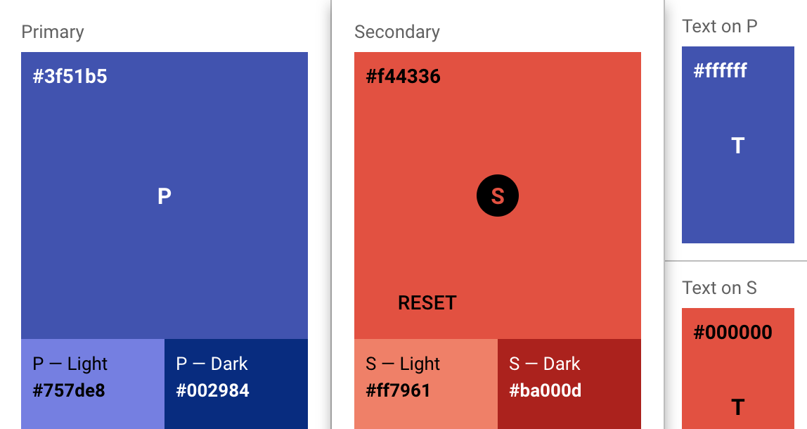
The output can be fed into createMuiTheme() function:
import { createMuiTheme } from '@material-ui/core/styles';

const theme = createMuiTheme({
  palette: {
    primary: {
      light: '#757ce8',
      main: '#3f50b5',
      dark: '#002884',
      contrastText: '#fff',
    },
    secondary: {
      light: '#ff7961',
      main: '#f44336',
      dark: '#ba000d',
      contrastText: '#000',
    },
  },
});
Tools by the community
- create-mui-theme Is an online tool for creating Material-UI themes via Material Design Color Tool.
- material-ui-theme-editor A tool to generate themes for your Material-UI applications by just selecting the colors and having a live preview.
- Material palette generator: The Material palette generator can be used to generate a palette for any color you input.